Kroger Rush
My time at Kroger was spent on the internal technology accelerator. We worked on quick timelines, short projects, and tested and validated big sky ideas. I was the sole designer on this team and worked with both internal developers as well as managed development with an offshore team.
Kroger Rush
Kroger Rush was a pilot program for a limited catalog of items delivered in 30 minutes or less for a fee.
Client and Platform: Kroger, eCommerce Innovations Team, iOS & Android
Time: August 2019 - Sept 2019
Sprint Cycle: One week
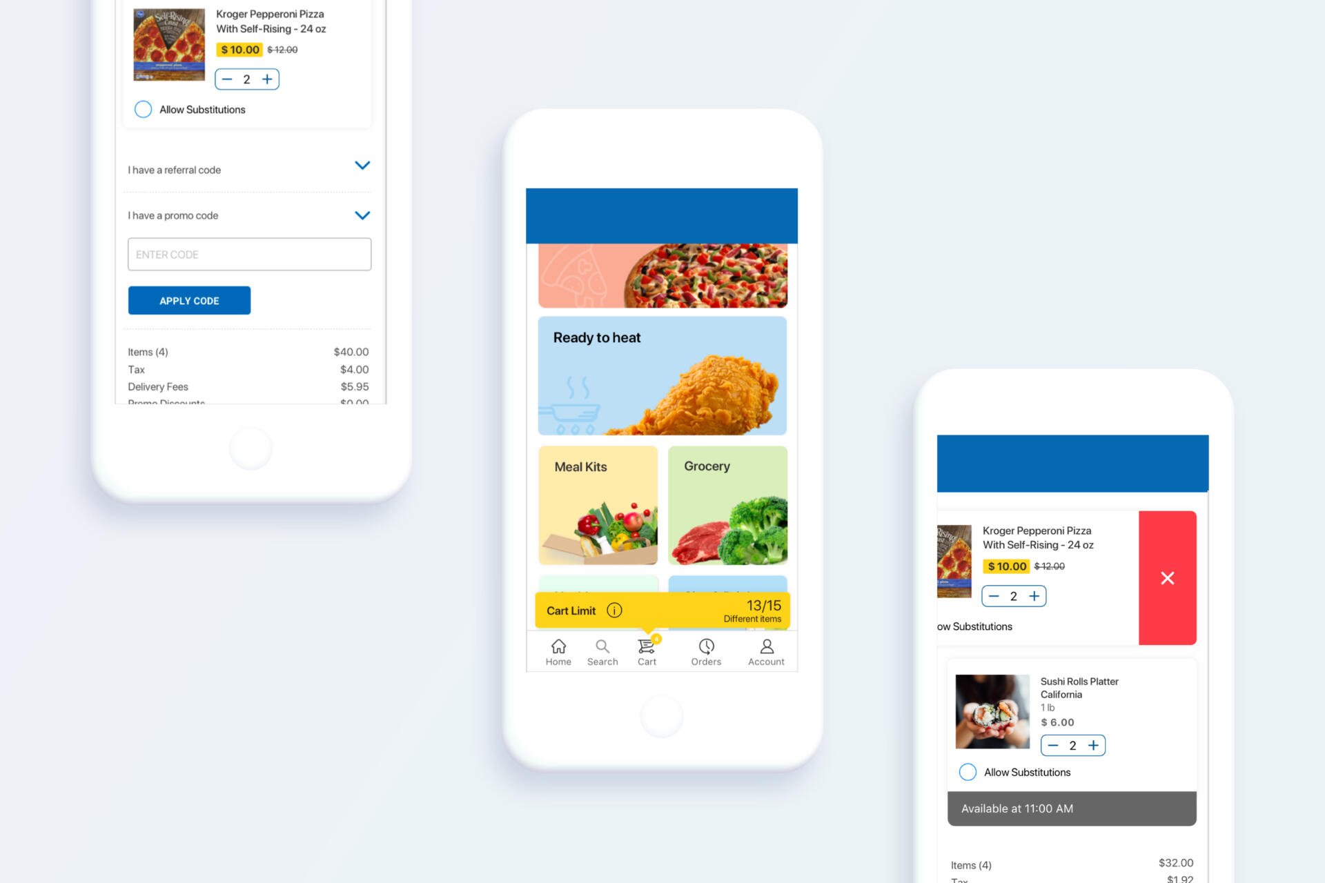
Kroger Rush was a 30 minutes or less delivery product by Kroger. While the larger project had broad KPIs, individual features were treated with care and concern. The In Progress Order feature was a feature that allowed a user to track their order, make updates to items while it was being shopped, and review their order information.
Challenge: After the launch of the In Progress Order feature, we got feedback that users did not know it existed and/or had difficulty accessing the information.
The first step was to gather all of our user feedback along with impression data that the engineering team put together on the In Progress Order feature. When the feature launched, users had to navigate to their order history screen to view the order in progress.
Goals:
Findable : Because the In Progress feature held up to date information from the driver delivering their order, we wanted the user to be able to access the information quickly.
Fast: Because of our one-week sprint cycle, I wanted to come up with a solution the engineering team could implement quickly, while still best serving the user.
Ideation: In order to remove some clicks and to surface the feature, I explored several visual options on the home screen of the application to be shown when the order is In Progress.


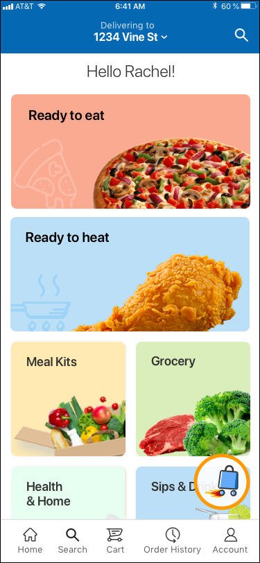


After an internal discussion with the project manager and team, I moved forward with an icon featuring our logo. We launched the new icon in the next sprint.
Results and Moving Forward:
At the end of the next sprint, I reviewed the impression data again. And while there was an uptick in page impressions, it was not as high as I had hoped.
I put together a quick A/B user test using two of our brand colors: Urgent Orange & (the current) Kroger blue. This test was unmoderated via Userzoom.
By changing the color of the Order Tracking button, we increased visibility by 78%. (9 seconds vs 46 seconds to first interaction)
I also learned that users valued accessing Order History as a tracking tool. 67% percent of users selected Order History as their first or second choice for tracking an order.
As a result, we changed the Order Tracking button to be the Urgent Orange.

